Set Collector
Role / Services
Research, Design, and Testing
Role / Services
Research, Design, and Testing
Role / Services
Research, Design, and Testing
Year
2024
Year
2024
Year
2024
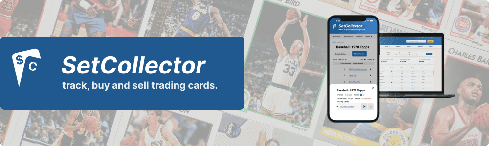
Set Collector, from eReader publisher Golgotha Press, aims to expand it's desktop database and trading platform to create responsive mobile and tablet versions, making it easier for trading card enthusiasts to find a needed card, catalogue existing collections, or to connect and barter with other trading card aficionados. What started as a deep dive into database design management became a crash course in people management and collaborative design.
the problem(s)
the problem(s)
I was paired up with 3 other product designers to help Golgotha Press convert Set Collector users from desktop cataloging to mobile and tablet.
Main Objectives
build mobile and tablet prototypes that hue close to the current desktop design
provide condensed solution for the content-heavy trading card information
keep revenue generating business objectives in mind while designing
Project Constraints
bootstrap approach - no research or testing yet
desktop design already in development
hand-off in 4-5 weeks
4 designers across 3 time zones
We got off on a not ideal start when our 4th team member got assigned at the last minute, making him unable to attend our intro meeting. This led to issues with roles pretty early on in the process.
We met with Scott Lacount, the lead product designer for Set Collector and head of Golgotha Press. He met with us weekly to give guidance and feedback as we worked.
the client
We met with Scott Lacount, the lead product designer for Set Collector and head of Golgotha Press. He met with us weekly to give guidance and feedback as we worked.
the client
We met with Scott Lacount, the lead product designer for Set Collector and head of Golgotha Press. He met with us weekly to give guidance and feedback as we worked.
the client
The bulk of my work was competitive research, usability testing, and managing the component library, and managing people.
my role
The bulk of my work was competitive research, usability testing, and managing the component library, and managing people.
my role
The bulk of my work was competitive research, usability testing, and managing the component library, and managing people.
my role
To meet Scott's needs, we set out to deliver the following:
Audit of current design
2 rounds of usability testing and analysis
Mobile and tablet prototypes
Component library
Potential branding and desktop updates
To meet Scott's needs, we set out to deliver the following:
Audit of current design
2 rounds of usability testing and analysis
Mobile and tablet prototypes
Component library
Potential branding and desktop updates
competitive analysis & the team
competitive analysis & the team
Normally, this is where I talk about how we spent a decent amount of time up front analyzing other trading card, or trading/cataloging, platforms for competitor solutions (which you can read here). But in delegating that work, there was some miscommunication regarding who would do what. Another designer submitted a write up for the database assigned to me. Not a big deal at all, but it ended up causing issues between two of my teammates. That miscommunication led to a perceived slight between them, followed by a fiery exchange of Slack messages.
This is how my duties "evolved" to more of a background, people management role, making sure that one team mate felt heard instead of dismissed, and the other felt included instead of dogpiled. As I'm ending my time with Springboard, some lessons in my curriculum include job hunting, interviewing, and soft skills. Soft skills are vital to managing this kind of friction in the workplace, and a timely part of the program. Cooler heads prevailed at this point, and we were able to move forward and focus on the user, actions, and behaviors.
the user
the user
Without much initial research, we had to rely on Scott for some direction while brainstorming. Trading card collection is a past time for all ages, but the average user for a platform like Set Collector is men between 40 and 60. This also influenced how we approached the design because the desktop was stylistically closer to websites/forums of years prior.
Without much initial research, we had to rely on Scott for some direction while brainstorming. Trading card collection is a past time for all ages, but the average user for a platform like Set Collector is men between 40 and 60. This also influenced how we approached the design because the desktop was stylistically closer to websites/forums of years prior.
user flows & actions
user flows & actions
After we felt confident with the context in which we were building, we started working on the main tasks that desktop users would need:
Catalog a card
Complete a set
Purchase a card
Setting a price alert
After we felt confident with the context in which we were building, we started working on the main tasks that desktop users would need:
Catalog a card
Complete a set
Purchase a card
Setting a price alert

usability testing | desktop
usability testing | desktop

There were definitely some hiccups in testing, and opportunities to enhance user guidance, streamline interface elements, and improve clarity in task workflows. These findings will be vital for refining the platform's user experience and addressing the diverse needs and expectations of its potential user base.
There were definitely some hiccups in testing, and opportunities to enhance user guidance, streamline interface elements, and improve clarity in task workflows. These findings will be vital for refining the platform's user experience and addressing the diverse needs and expectations of its potential user base.
findings & recommendations
findings & recommendations
Overall Summary of Key Findings:
Navigation and Usability: Participants generally found the navigation straightforward but encountered challenges with specific functionalities like button actions and expected outcomes.
Feedback on Tasks: Clear instructions were appreciated, though some confusion arose around task specifics such as user actions and expected results.
Interface and Design: Comments on interface clarity, use of space, and consistency across tasks highlighted areas for improvement.
wireframes
wireframes
As I was in the process of working on my portfolio, a tip I got from a front end developer friend - to start with mobile and enlarge your designs. Or at the very least, keep the breakpoints in mind while designing.
Because we were having some friction early on, it quickly became advantageous to split up the work and reconvene with our results. This works well for things like competitive analysis and testing where we could use that to our advantage.
But when it comes to designing for different breakpoints, this is not the way to go. Mobile ended up without bulk actions or a way to illustrate ownership status. We ended up pulling the designs together in the end, but the process didn't foster cohesion.
Mobile Wireframes
Mobile Wireframes


A big source of friction thus far is the design and behaviors associated with ownership status. To best support the business goals (affiliate links), each item, set, or card has a designated status - Owned, Need, and Not Owned, Need being a card or item the user is actively searching. Once we moved to high fidelity, our mobile designer added color an icon to the alternating-per-row background color.
A big source of friction thus far is the design and behaviors associated with ownership status. To best support the business goals (affiliate links), each item, set, or card has a designated status - Owned, Need, and Not Owned, Need being a card or item the user is actively searching. Once we moved to high fidelity, our mobile designer added color an icon to the alternating-per-row background color.
There was yet another miscommunication about who would be in charge of which high fidelity screens for testing. I had been tasked with the tablet UI and prototype, and there was confusion over who would handle the desktop. As soon as the pause presented itself, I inserted myself into the discussion and ceded my role of the tablet. I can make myself useful elsewhere, like testing and recommendations.
There was yet another miscommunication about who would be in charge of which high fidelity screens for testing. I had been tasked with the tablet UI and prototype, and there was confusion over who would handle the desktop. As soon as the pause presented itself, I inserted myself into the discussion and ceded my role of the tablet. I can make myself useful elsewhere, like testing and recommendations.
Brand Design, Accessibility, and A Close Call
Brand Design, Accessibility, and A Close Call
As mentioned previously, one of the constraints for our work is the fact that Set Collect's desktop is in development, so they stayed close to that while designing. So one designer took the opportunity to recalibrate and make suggestions for branding and UI design.
As mentioned previously, one of the constraints for our work is the fact that Set Collect's desktop is in development, so they stayed close to that while designing. So one designer took the opportunity to recalibrate and make suggestions for branding and UI design.


usability testing | mobile & tablet
usability testing | mobile & tablet
I prototyped the new screens and ran another round of usability testing. Because we tested the desktop at the start of our project, and I am testing mobile and tablet prototypes here, this isn't a 1:1 comparison. There were communication snafus between designers and a time crunch. This led to only mobile and tablet screens ready to prototype and test, but we did provide a blueprint for UI and accessibility improvements.
I prototyped the new screens and ran another round of usability testing. Because we tested the desktop at the start of our project, and I am testing mobile and tablet prototypes here, this isn't a 1:1 comparison. There were communication snafus between designers and a time crunch. This led to only mobile and tablet screens ready to prototype and test, but we did provide a blueprint for UI and accessibility improvements.
Our team member in charge of the tablet screens observed that the user flows for purchase a card and complete a set ended up being practically identical, so we left purchase a card out for tablet testing.
Our team member in charge of the tablet screens observed that the user flows for purchase a card and complete a set ended up being practically identical, so we left purchase a card out for tablet testing.

Test Findings
Test Findings


There's definitely work to be done here. We're still bumping up against information architecture, so we'll need to come up with something more elegant to improve the user experience for item details.
There's definitely work to be done here. We're still bumping up against information architecture, so we'll need to come up with something more elegant to improve the user experience for item details.

Tablet dimensions give us way more room to work. We kept the general path and behaviors from the desktop screens. We're also seeing another version on the Owned/Need/Not Owned designation, in chip form this time.
Tablet dimensions give us way more room to work. We kept the general path and behaviors from the desktop screens. We're also seeing another version on the Owned/Need/Not Owned designation, in chip form this time.
recommendations & updates
recommendations & updates
I also spitballed few ideas of how best to take advantage of the limited space on mobile, mostly by reducing redundancy. One possible solution was to put a red background behind NEED items, removing the red icon and giving us some space back.
I also spitballed few ideas of how best to take advantage of the limited space on mobile, mostly by reducing redundancy. One possible solution was to put a red background behind NEED items, removing the red icon and giving us some space back.

We could then push buying actions inline. Scott was very partial to the icon and background, so in the end, these lockups won the day.
We could then push buying actions inline. Scott was very partial to the icon and background, so in the end, these lockups won the day.

looking ahead
looking ahead
The collaborative part of this project did not go as smoothly as I would have liked, but I learned some really valuable lessons in freelance UX work. I've been a creative professional for long enough that I tend to take soft skills for granted. I wish we could've all taken the opportunity to understand each others' processes and working styles. Maybe set some boundaries and establish some house rules. In spite of that, when things went well, they went really well and Scott was happy with our final solutions.
The collaborative part of this project did not go as smoothly as I would have liked, but I learned some really valuable lessons in freelance UX work. I've been a creative professional for long enough that I tend to take soft skills for granted. I wish we could've all taken the opportunity to understand each others' processes and working styles. Maybe set some boundaries and establish some house rules. In spite of that, when things went well, they went really well and Scott was happy with our final solutions.